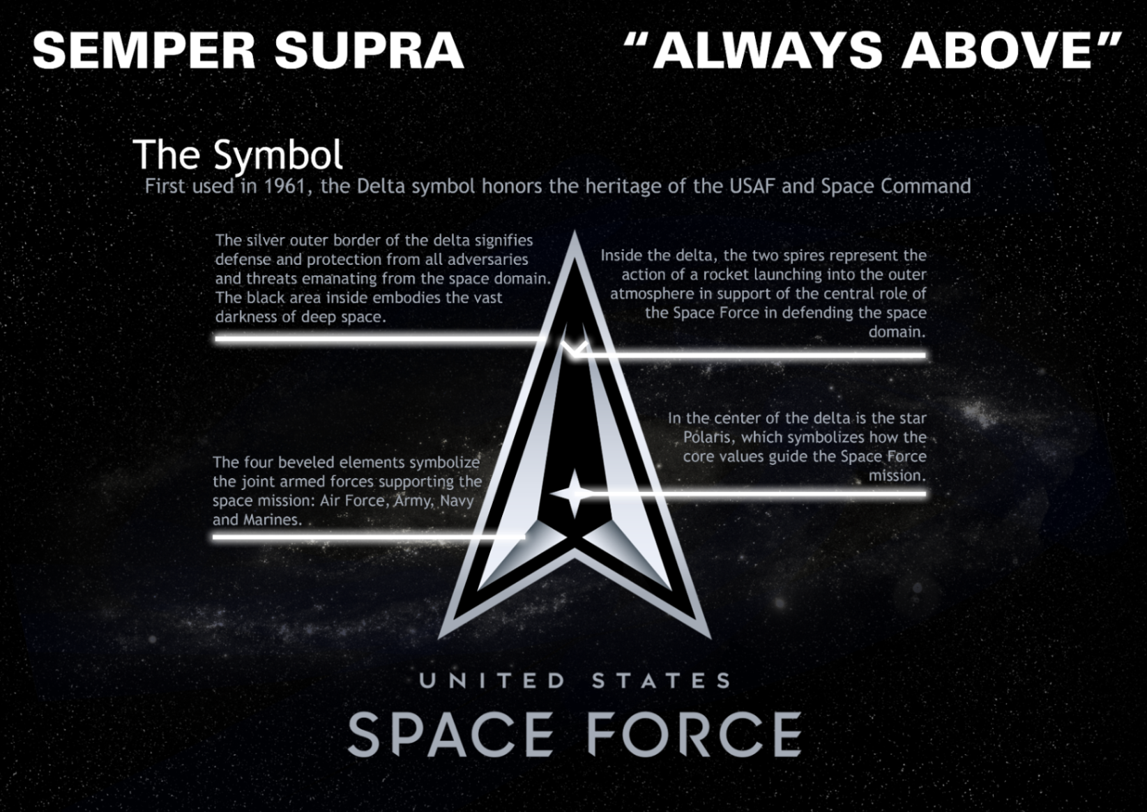
We have already written about a new branch of the US military many times at WMASG, and in today's post we would like to present you the final logo and motto of the US Space Force.
Semper Supra (Always Above) will be the maxim to which "space soldiers" will refer to in their actions. The motto is intended to represent the role of these forces in establishing, sustaining and upholding US operational freedom in outer space.
The logo was designed of the Air Force Department by the GSD&M advertising agency.
The black and silver colors represent the boundary between Earth and space.
The silver outer edge of the delta stands for defense and protection against space threats.
The black area inside personifies the boundless darkness of outer space.
Inside the delta, two spires symbolize the launch of a rocket into the atmosphere.
The four angular elements symbolize the combined forces supporting the US mission in space: Air Force, Army, Navy, and Marine Corps.
In the center of the delta is the North Star, which is to symbolize the guiding light and the basic values that are to guide the new forces.
After its official presentation in January, the delta symbol has received considerable criticism and allegations that it looks like a copy of the Starfleet logo from the Star Trek series. Representatives of the US Space Force, in response to the allegations, indicated that the delta symbol was used by the United States Air Force in the 1940s and was used in the early emblems of the Air Force space organizations as early as 1961 and symbolizes the heritage of military space organizations.
Source: spaceforce.mil

